A trend can make a website interesting while getting in the way of what the company needs to explain. Visitors arrive to understand an offer, review work or find contact information. Design should make that route clearer.
In 2026, AI-assisted interface creation expands the range of compositions teams can explore. It also makes choosing a direction that fits the brand more important. This guide offers criteria for evaluating references before they become your next website.
Use a trend to answer a real need
Webflow’s editorial overview for 2026 presents expressive design directions. It is a source of references, rather than evidence that every business needs the same features. Visual popularity and commercial suitability are different questions.
Consider a company offering a service that takes some explanation. A composition organizing the stages may help more than a cinematic opening. A creative studio, meanwhile, might use one memorable visual gesture to demonstrate its character while keeping the offer readable.
- What information does this feature make easier to understand?
- Does it fit the company’s identity?
- Does the page remain useful without the effect?
Give typography character without making reading harder
Large type can create a memorable opening, but it needs to fit on a phone and work with the rest of the copy. A headline filling the whole screen may push the explanation and contact options too far away.
Before choosing a typeface for impact alone, test real service names, long words and approved headlines. Compare them in a narrow column. Good typographic direction is evident in navigation, captions and answers to questions as well as the opening statement.
Use glass to establish hierarchy
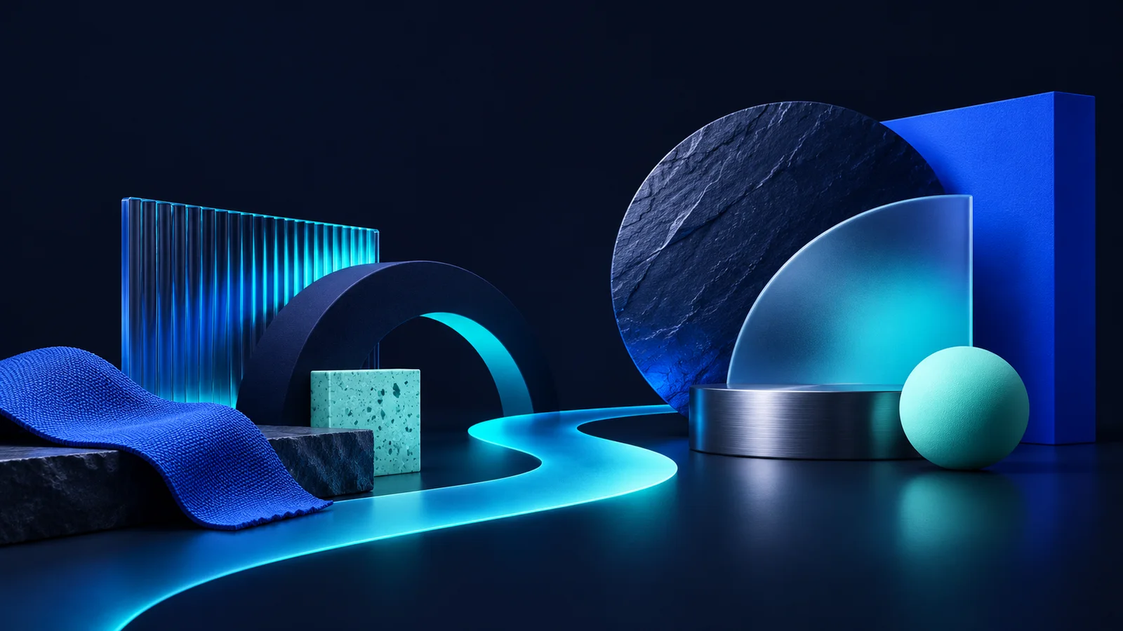
Translucent surfaces can separate navigation from the page or emphasize a choice. Problems appear when every element uses transparency, blur and glow. Visitors can lose track of which layer matters and where they can click.
Reserve the material for a few places with a clear role. When an active image sits behind a card, try a more solid surface beneath its text. The identity can still feel technological without making people decipher words against an unstable background.
Let motion confirm an action
A card responding to a pointer can suggest an interactive area. A gentle expansion can help readers follow a FAQ answer. These effects are useful when they reinforce something the visitor has just done, rather than demanding attention constantly.
Consider touch and keyboard use too. Essential information must not depend on hover. Remove the effect and the button should still look like a button, while the reading order remains intact. Plan that alternative from the beginning.
Compare references using real content
Demonstration layouts often use short titles, carefully framed pictures and a small number of items. A real business may have more content, longer names and different photography. That is where the composition needs to demonstrate its usefulness.
Use AI to explore alternatives based on approved material, then compare them with the actual services and cases. Do not invent figures or customers to fill an attractive space in a reference. Reorganize the block to make the available evidence work.
Choose a direction and keep it coherent
A website does not need every trend to feel current. Choose a central idea and maintain consistent decisions about space, colour, headings and interaction. This lets people focus on content when moving between pages.
At MissaciWeb, landing pages, business websites and e-commerce projects start with business context. Visual references are adapted to what the company needs to present. The next step is a conversation about goals, audience and available material before effects become a list of requirements.
The next step is to connect the idea to a defined scope. Compare the landing page, business website and e-commerce plans and explore the five-stage project methodology to see how the business context guides the website.
A checklist to take away
- Choose features that solve a communication need.
- Test real headings and images on phones.
- Give glass and motion clear roles.
- Keep content and contact accessible without hover.
- Maintain a coherent direction across pages.
Sources and further reading
Updated .